Brutalism for the wrist
By Sam Okafor, London ·
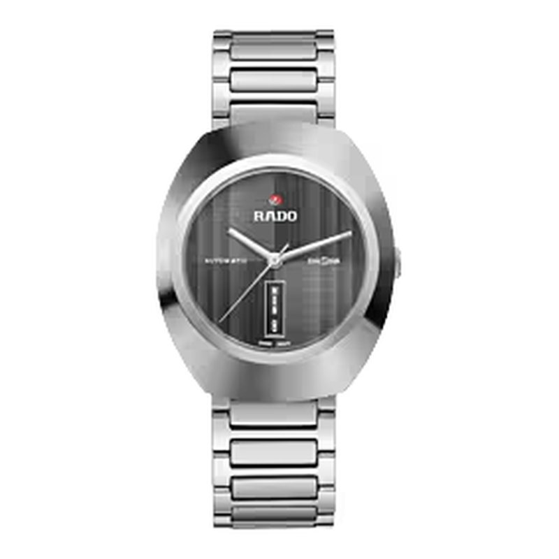
Rado launched the DiaStar in 1962, the same decade that gave London the Barbican and the Trellick Tower, and you can feel it. This is not a pretty watch. It's a faceted, bevelled slab of a thing with a crystal cut like a gemstone and a case that seems to have been carved rather than turned. I find it completely fascinating.
The point was durability, a case and crystal that wouldn't scratch, and the design follows from that brief in the way good brutalist buildings follow from their concrete. The surfaces are hard, the edges are sharp, and nothing is softened for the sake of comfort. The faceted crystal throws light around the grey dial so that the indices and the day and date window jump in and out of view as you move your arm. Legibility is not its first concern.
On paper it's very reasonable: 38 mm across, 11.9 mm thick, 20 mm lugs, 100 m, sapphire, a closed back and an 80-hour reserve from the Powermatic 80, which covers a lazy Saturday and Sunday with time to spare. The metal bracelet is part of the design and I'd not swap it.
The downsides are the ones you'd expect. It's a divisive object and lots of people will think it's ugly. Some will be right. The day and date window adds clutter to a dial that already has plenty of reflections to deal with. And the case, with all those facets, is not something you can wear with a slim dress shirt without the cuff catching.
At 1,900 to 2,200 dollars it's also a little more than its movement alone would suggest. You're paying for the shape. If you like the National Theatre, buy one. If you've signed a petition to knock it down, don't.